Responsive Image Generator
Turn one image into a full set of responsive sizes with a ready-to-paste srcset snippet. Ship lighter images to smaller screens and watch your Largest Contentful Paint (LCP) drop — free, no signup.
Max 500MB to unlimited • PNG, JPG, GIF, WebP, AVIF, SVG, HEIC, TIFF, BMP
Sign Up for unlimited conversions
See it in action
Upload, convert, and download a complete responsive image pack in seconds.
Every size, in one zip
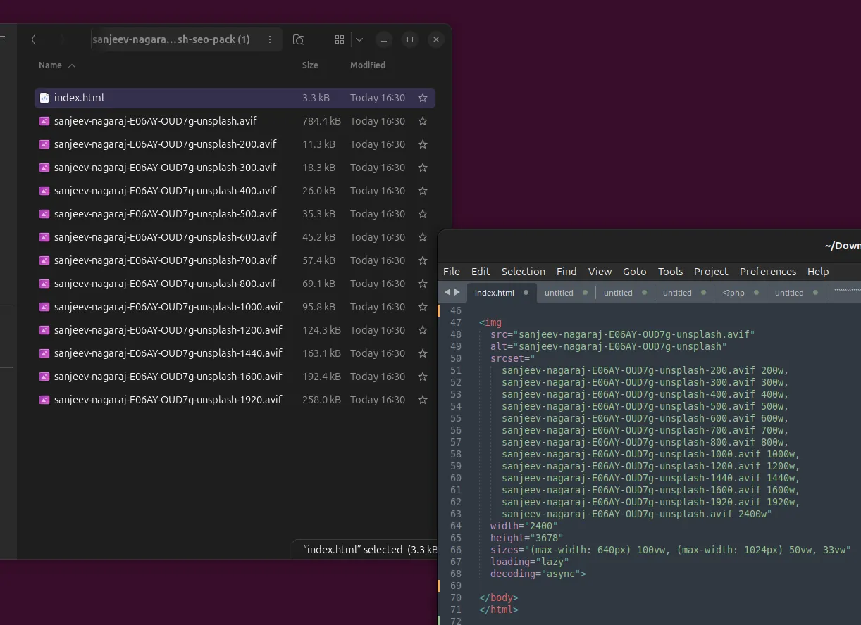
Download a single archive with each scaled variant plus an index.html. Notice how the smallest file is a few kilobytes while the original is hundreds — that gap is exactly what a phone saves on load.
- index.html3.3 KB
- sanjeev-nagaraj-E06AY-OUD7g-unsplash-200.avif11 KB
- sanjeev-nagaraj-E06AY-OUD7g-unsplash-300.avif18 KB
- sanjeev-nagaraj-E06AY-OUD7g-unsplash-400.avif26 KB
- sanjeev-nagaraj-E06AY-OUD7g-unsplash-500.avif35 KB
- sanjeev-nagaraj-E06AY-OUD7g-unsplash-600.avif45 KB
- sanjeev-nagaraj-E06AY-OUD7g-unsplash-700.avif57 KB
- sanjeev-nagaraj-E06AY-OUD7g-unsplash-800.avif68 KB
- sanjeev-nagaraj-E06AY-OUD7g-unsplash-1000.avif94 KB
- sanjeev-nagaraj-E06AY-OUD7g-unsplash-1200.avif122 KB
- sanjeev-nagaraj-E06AY-OUD7g-unsplash-1440.avif160 KB
- sanjeev-nagaraj-E06AY-OUD7g-unsplash-1600.avif188 KB
- sanjeev-nagaraj-E06AY-OUD7g-unsplash-1920.avif252 KB
- sanjeev-nagaraj-E06AY-OUD7g-unsplash.avif767 KB
One image → many weights
- 200w11 KB
- 300w18 KB
- 400w26 KB
- 500w35 KB
- 600w45 KB
- 700w57 KB
- 800w68 KB
- 1000w94 KB
- 1200w122 KB
- 1440w160 KB
- 1600w188 KB
- 1920w252 KB
- orig767 KB
<img
  src="sanjeev-nagaraj-E06AY-OUD7g-unsplash.avif"
  alt="Mountain landscape at sunset"
  srcset="
    sanjeev-nagaraj-E06AY-OUD7g-unsplash-200.avif   200w,
    sanjeev-nagaraj-E06AY-OUD7g-unsplash-400.avif   400w,
    sanjeev-nagaraj-E06AY-OUD7g-unsplash-800.avif   800w,
    sanjeev-nagaraj-E06AY-OUD7g-unsplash-1200.avif 1200w,
    sanjeev-nagaraj-E06AY-OUD7g-unsplash-1920.avif 1920w"
  sizes="(max-width: 640px) 100vw, (max-width: 1024px) 50vw, 33vw"
  width="1920"
  height="1280"
  loading="lazy"
  decoding="async">
The browser picks the right size
This image ships a full srcset. Resize your window or open it on a phone — a lighter file loads on smaller screens, automatically.
LCP SEO Pack — responsive image sizes in one zip
Convert your image and get an SEO-ready pack of scaled sizes with copy-paste srcset markup. Browsers then serve lighter images to smaller screens, improving your Core Web Vitals — specifically Largest Contentful Paint (LCP).
- Up to 16 scaled sizes per image — 200px for phones up to 5K desktops
- Variants keep your chosen format: WebP, AVIF, PNG, JPG and more
- One .zip download with every size plus an index.html snippet
- Ready-to-paste <img srcset> code — no manual markup, minimal effort
- Smaller images on small screens = faster Largest Contentful Paint (LCP)
<img srcset> snippet, zipped and ready to paste Why responsive images boost SEO
Faster LCP
Smaller hero images paint sooner, directly improving Largest Contentful Paint.
Better rankings
Core Web Vitals are a Google ranking signal — passing them helps you compete.
Less mobile data
Phones download a 20 KB image instead of a 700 KB one — happier visitors.
The fastest way to create responsive images for the web
Our responsive image generator turns a single upload into a complete set of scaled image sizes and the exact srcset markup modern browsers need. Instead of manually exporting a dozen widths in Photoshop and hand-writing HTML, you get a ready-to-ship responsive images pack in seconds — free, private, and without installing anything. It is the simplest way to serve the right image to every device and keep your pages fast.
Better LCP and Core Web Vitals
Images are usually the heaviest thing on a page, which makes them the number-one cause of a slow Largest Contentful Paint (LCP). When a phone downloads a 2000-pixel hero photo it never needed, your Core Web Vitals suffer and Google notices. By generating a proper srcset with a matching sizes attribute, the browser picks the smallest file that still looks sharp — often cutting image bytes by 80% or more on mobile. Faster LCP optimization means better page speed, higher Lighthouse scores, and a stronger position in search results.
Modern formats: WebP and AVIF
Every variant keeps the output format you choose, so you can generate WebP responsive images or next-generation AVIF responsive images alongside classic PNG and JPG. WebP and AVIF compress far smaller than legacy formats at the same quality, so pairing a modern format with responsive srcset sizes compounds the savings. The result is a lean, modern image pipeline that loads quickly on 4G, slow Wi-Fi, and high-density retina displays alike.
No manual markup — just copy and paste
The download is a single .zip containing every generated width plus an index.html with a ready-to-paste <img srcset> snippet — including the sizes attribute and correct width and height to prevent layout shift (CLS). Drop the files onto your server or CDN, paste the snippet, and you have a fully optimized responsive image live on your site. It works with any stack — WordPress, Shopify, Next.js, Laravel, plain HTML, or a static site.
A free image resizer for web performance
Whether you call it an image resizer for web, a srcset generator, or a multiple image sizes generator, the goal is the same: ship lighter images, improve mobile performance, and pass Core Web Vitals. Upload a photo, choose your format and quality, and let the tool build the full responsive set for you. Your files are processed privately and can be deleted within minutes — no account, no watermark, and no limits to get in your way.
Responsive image FAQ
What is a responsive image generator?
It takes one image and produces multiple scaled versions (widths) plus the srcset markup that tells browsers which size to download. The right image loads for each screen, so mobile visitors never pull a desktop-sized file.
How does srcset improve LCP and Core Web Vitals?
Largest Contentful Paint measures how fast the biggest element (often a hero image) appears. Serving a small, appropriately sized image on phones cuts bytes dramatically, so the image paints sooner and your LCP and overall Core Web Vitals scores improve.
Which formats can I generate responsive images in?
Any raster output we support — WebP, AVIF, PNG, JPG and more. The variants keep the format you convert to, so you get modern, well-compressed responsive images.
Do I have to write the srcset HTML myself?
No. The download includes an index.html with a ready-to-paste <img srcset> snippet already wired to every generated size — copy it into your site and you are done.
Is it free and private?
Yes. There is no signup, and you can opt in to have every uploaded file deleted within minutes of converting. We do not keep permanent copies.
Generate your responsive images now
Free, no signup. Convert to WebP or AVIF, tick “SEO & Speed”, and download every size with the srcset snippet.